Mastering The Art of Typography in Web Design
Typography is one of the most important aspects of web design. It involves not only the selection of fonts but also the placement, size, and spacing of text. This can greatly impact the readability, accessibility, and overall aesthetics of a website. In this section, we will discuss various typography techniques, web design principles, and typography trends that can help you master the art of typography in web design. Click here to see some examples of how I have used typography on client websites.
Web Design Typography Takeaways:
- Typography in web design is crucial for creating visually appealing and user-friendly websites.
- Effective typography includes font selection, font pairing, and typography hierarchy.
- Typography trends in modern web design include bold and expressive typography, unique and artistic fonts, and minimalist designs.
- Responsive typography is essential for ensuring optimal readability and usability across different devices.
- An accessible and inclusive typography design incorporates factors like color contrast, legibility, and assistive technologies to create a usable experience for all users.
Typography Techniques for Web Design
Effective typography is crucial for creating visually appealing and user-friendly websites. Here are some typography best practices and techniques that can help you elevate your web design game:
- Font Selection: Choose fonts that align with your brand and website’s aesthetic. Consider factors like legibility, readability, and web-safe fonts.
- Font Pairing: Combine different fonts to create contrast and balance. Pair serif and sans-serif fonts to create a harmonious design.
- Typography Hierarchy: Use font size, weight, and style to create a visual hierarchy that guides users through your website. Use headers and subheaders to break up content and prioritize information.
- Creating an Appealing Visual Hierarchy: Use whitespace, contrast, and alignment to direct users’ attention to key elements on your website. Ensure that your typography complements your website’s color scheme and design elements.
By implementing these techniques and best practices, you can create effective typography that enhances user experience and engagement on your website.
Web Design Principles and Typography
Good typography is one of the essential web design principles that can enhance the user experience on your website. Typography affects the readability, accessibility, and overall tone of your design, which makes it crucial to understand the relationship between typography and web design.
The right typography can make your website more user-friendly, while the wrong typeface and font size can negatively impact the user experience. Therefore, web designers must consider typography as they create different design elements within the website hierarchy.
Typography guides users through your website and enables them to find what they’re looking for quickly. It’s also an essential tool for branding and making your website look professional. Typography choices should be based on the target audience and should complement the design’s overall style and tone.
Incorporating proper typography techniques in your web design can help improve the overall user experience and accessibility. By considering web design principles and typography, you can create cohesive, engaging, and user-friendly websites that satisfy both your aesthetic and functional goals.

Typography Trends in Modern Web Design
In today’s digital age, where visual content reigns supreme, typography has become a crucial element of web design strategy. From bold and expressive typography to unique and artistic fonts, the world of typography is constantly evolving, and designers are pushing the boundaries to create visually striking and memorable websites.
The latest typography trends reflect both a desire for minimalism and an appreciation for artistic expression. The minimalist trend demonstrates a focus on simple, legible, and understated fonts that make the message clear and easy to read. On the other hand, the artistic trend, also known as expressive typography, emphasizes the artistic expression of fonts and uses diverse designs to express emotion and provoke reactions.
One of the most popular trends in modern web typography is the use of variable fonts. Variable fonts are a new kind of font technology that allows for more versatile design possibilities. They are a single font file that can dynamically adjust to produce a range of styles, such as weight, width, and slant.
Another trend is the use of geometric fonts that have clean lines and a modern look. These fonts are versatile and can be used in a variety of applications, such as headings, logos, and body text.
Finally, designers are finding creative ways to use typography and font pairing to create dynamic visual hierarchies that guide the user’s attention and make the content more engaging. By combining fonts with different styles, designers can create eye-catching and unique designs that grab the user’s attention and communicate a message.
Staying on top of typography trends is essential for creating exceptional web design. Designers who keep up with the latest typography trends know how to effectively communicate a message with typography, resulting in visually striking and memorable websites.
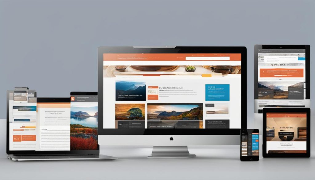
Responsive Typography for Different Devices
In the age of mobile devices, having responsive typography is essential for creating a user-friendly website. Responsive typography means adapting website typography to different screen sizes and resolutions, ensuring optimal readability and usability on all devices.
One technique for achieving responsive typography is fluid typography, where font sizes and line heights adjust based on the screen size. This allows for a seamless reading experience on both desktop and mobile devices. Another technique is using responsive grid systems, where the typography is arranged in a grid that adjusts to fit the screen size.
It’s also important to consider contrast and legibility when designing responsive typography. The font size and contrast should be sufficient for users to read comfortably, regardless of the device they are using.
Overall, responsive typography is a crucial aspect of web design that enhances user experience. By implementing fluid typography and responsive grid systems, you can ensure that your website delivers a consistent and accessible reading experience across all devices.
Typography’s Impact on User Engagement
Typography is a significant factor in determining user engagement and overall user experience. The right typography can capture user attention and guide them through your website. On the other hand, poor typography can lead to confusion and frustration, ultimately causing users to leave.
In web design, different typographic elements such as font choice, size, spacing, and alignment play a crucial role in influencing user perception and interaction. For example, a serif font can evoke a traditional and formal tone, while a sans-serif font can convey modernity and informality. The size of the font can affect legibility, while spacing can help establish the visual hierarchy of your content.
Furthermore, typography can evoke specific emotions in users, impacting their overall experience on your website. The use of bold and expressive typography can create a sense of urgency or excitement, while sophisticated and elegant typography can convey professionalism and reliability.
Incorporating effective typography into your web design can significantly enhance user engagement and overall user experience. By considering the impact of different typographic elements on user perception and interaction, you can create visually appealing and user-friendly websites that capture and retain user attention.
Designing an Accessible and Inclusive Typography
Accessibility and inclusivity should always be a top consideration in web design. A key aspect of promoting inclusivity through design is ensuring that typography is accessible and usable for all users. In this section, we’ll explore the principles and techniques for designing typography that is both accessible and inclusive.
One critical consideration to keep in mind is color contrast. Insufficient contrast between text and the background can make it challenging for users with visual impairments to read content. Strive for a contrast ratio of at least 4.5:1 between text and the background color.
Legibility is also crucial for promoting accessibility. Choose fonts that are easy to read, and avoid decorative fonts that can be challenging to decipher, particularly for users with dyslexia. Additionally, consider adjusting font size and line spacing to improve legibility. While smaller fonts may look visually appealing, they can be difficult to read, particularly for users with visual impairments.
Assistive technologies, such as screen readers, can also help users with visual impairments access websites. However, to ensure that assistive technologies can work correctly, it’s vital to use semantic HTML and provide alt tags for images. Alt tags help users understand the content of an image if they are unable to see it.
Designing an accessible and inclusive typography is a critical step in creating a user-friendly website. By considering factors such as color contrast, legibility, and assistive technologies, designers can ensure that all users can access and understand website content.
Putting it All Together: Creating Outstanding Typography in Web Design
Incorporating effective typography techniques and web design principles is crucial for creating visually stunning and engaging websites. By understanding the importance of typography and how it can impact user engagement, you can elevate your web design game to the next level. Here are some practical tips to help you create outstanding typography in web design:
- Balance – Strive for a balance between font size, spacing, and alignment to create a visually appealing and easy-to-read text.
- Font Pairing – Use different fonts for headlines and body text to create contrast and hierarchy. Use font pairing tools to ensure that the fonts complement each other.
- Typography Hierarchy – Create a typography hierarchy to guide users through the website. Use different font sizes, weights, and colors to distinguish between different sections and emphasize important information.
- Whitespace – Use whitespace effectively to create a clean and uncluttered layout. Whitespace can also help improve the readability of the text by increasing the contrast between text elements.
- Responsive Typography – Ensure that your typography is responsive to different screen sizes. Use fluid typography and responsive grid systems to adapt the font size and spacing for different devices.
By incorporating these techniques and principles, you can create typography that not only looks visually appealing but also enhances user experience. Remember, the key to outstanding typography in web design is to strike a balance between form and function to create effective and engaging typography.